Posts

Showing posts from 2013

Responsive Web Design: 3 Considerable Marketer Benefits to Apprehend

Image
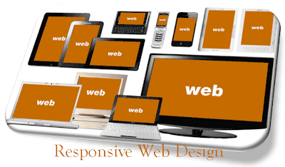
We are very well acquainted with the term Responsive Web Design. In a nutshell, it is an inexpensive and time-saving strategy of creating websites to provide an optimal viewing experience on various distinct devices like desktop, mobile, tablet, etc. With the help of Responsive Web Design, a website is created, which is compatible with all sorts of digital web devices. In spite of being affordable and maintainable, Responsive Websites have numerous SEO benefits that traditional websites do not have. Some reasons are given below that explains the 3 major marketing benefits of Responsive Web Design website: Increases The Value Of Your Site The value of your site and the search engines increase with a Responsive Web Design. There is no need to worry about refurbishing the websites for several other versions like tablet, desktop, mobile, etc. in order to keep them consistent. Due to Responsive Web Design, the content of your site will become consistent over as

Few Consequential Facts About Mobile Web Application Development

Image
Earlier, mobile phones were used just for sending and receiving calls or messages. Gone are the days, when it was just an appliance. But, now the usefulness of mobile phones has increased much farther. Any task related to communication can be accomplished by it, may it be watching movies, drafting email, listening to music, creating presentations, etc.  The prime reason behind its feasibility is the evolution of internet on mobile phones. According to an astonishing prediction, there will be around 1.7 billion mobile internet users by 2013. Increased Usage O f I nternet O n Mobile Phones: Due to the rapid growth of the features of mobile phones, website owners start building their websites as per the mobile devices features. This is a substantial step to take as it will save website owners from losing their promising clients’. This is the main reason why web development services provider find mobile web application development services necessary to include within the

Why jQuery Touch App Development: Delve Into Reasons

Image
A few decade ago, the call-only mobile phone was launched. Then, after few years there comes a feature phone that is packed with camera, audio, video, etc. And, at present the smart phone is trending. Smart phones are packed with high-speed processor, amazing graphics, superb digital camera and lots more. This smart phone has opened the gate for many advanced applications like social networking, online gaming, e-commerce transactions and much more. To develop all these apps, various mobile apps development tools/frameworks have been released. Among them, jQuery touch app development is one of the best touch - optimized solutions. Today in the world of the internet, all the users are connected with web applications on their desktop/Laptops. Owing to which, they want the same experience on their smart phone.    Deploying web application on the mobile phone is very cumbersome because: Size of the output screen matters Compatibility issues with different phones

Sencha Touch Development: Explanation Of Some Essential Concepts

Sencha touch application development is revolving around us since very long time. But, during the last couple of years it has gained an immense popularity. It is a leading technology for mobile HTML that assists developers in building apps with the help of CSS3 and HTML5 for different mobile platforms. Conventional Mobile Development Concepts Earlier, the popularity of the mobile apps were not well-known before the release of iPhone. Several smartphones were there in the market, but no one gave such a boost to mobile app development until the launch of iPhone. The floodgates open as soon as Apple Inc. gave the permission to other independent app developers and software development companies to develop apps for iPhone with the help of iPhone SDK and other platform-specific tools. Sencha Touch Development Speciality If Sencha touch developers are unaware about few functionalities of iPhone, BlackBerry or Android, then they may still make use of HTML5 and CSS3 fo

Important Concepts Of Hybrid Mobile Application Development

Hybrid mobile application development is the combination of two essential technologies named as web development technology and native mobile application development technology . Native programming language is used to form these hybrid applications such as Java or Objective C and web technologies like JavaScript, CSS and HTML5. Hybrid application is a thin native container whose front-end part is absolutely native. Any of the mobile application programming languages can be used in order to develop it. For different platforms, different containers are required to be built by mobile developers. For example, iOS with IPA extension, Android supports native apps with apk extension, and windows phone with xap extension. All these are the formats of executable files that can be downloaded from any of the app stores of Android, iOS,and windows phone. The remaining part is developed by using web technologies, which is a web application. This part also depends upon the concept of

PSD to Mobile Conversion: Is Your Website Mobile Responsive?

Image
“No person in the world is without a mobile phone.” this truth is beyond the imagination, which is due to the silent revolution that is taking place all over the world. In the past, there were no mobile phones, people used to communicate with their Kith and Kin with the help of a landline phone. But, now no one can imagine life without a Smartphone. This is the main reason why websites should be mobile compatible, so that everyone can access it through their smartphones from anywhere. PSD to Mobile Conversion With the help of this service, websites can be accessed easily through smartphones having varied screen sizes and browsers with the output exactly the same as in the case of desktops, laptops, etc. Site should be properly navigated and the content presentation should not encounter any changes. All this is possible by chopping PSD files into mobile templates in order to make them mobile responsive website. These websites have paved the way for business expansion and better re

PSD To HTML Conversion: Some Crucial Steps To Consider

Image
For any online business, PSD to HTML conversion keeps a great importance. A website is considered the backbone for the web business. In order to make a website, the design is first created in Photoshop, which is later converted into HTML markup. This process happens to be important in the process of web development. And, it is worth to mention that this conversion is not simple at all and one should hire a talented developer to execute the process. Whether you are a novice or a professional developer, there are some important steps that should be kept in mind: Make a deep analysis of Photoshop files:  You need to analyze the PSD files in order to comprehend the intricacies of the conversion. After this, organize the essential steps such as addition of CSS codes and splitting mock-up. Follow the slicing of Photoshop files: Once you are done with the slicing of PSD images, there is a set of layers that should be combined to add the necessary elements. Add unique a

Responsive Web Design: know What is Responsive Web Design

Image
The concept of 'write once and run everywhere' for website designing has changed the way to view the web, which is no longer restricted to the desktop.  Responsive web design  is highly-optimized to respond the user's behavior and environment; depending on the device it is being viewed. This succinct infographic covers the manifold advantages and key features of responsive web design.

HTML5 VS Native App: Who will be the Winner?

Image
The discussion of HTML5 versus native apps has been going on from long period of time. HTML5 apps are used to housed on the web and runs inside a mobile browser, whereas native apps are constructed specifically for different mobile devices. The biggest strength of HTML5 is that it is written once, but it can run from anywhere. Most of the developers are preferring Native apps who are having money resources and enough time while others are using HTML5 in order to truncate the development time. Take a look at this HTML5 VS Native App infographic where various essential trends are covered. Analyze the aspects of HTML5 and native apps. According to the illustration of the HTML5 VS Native App infographic, in some areas Native Apps rules over HTML5 such as  HTML5 is still facing challenges in order to access the device-native features These apps are less secure, are slower and don’t work well offline along with this it is also not having a comfortable play or app store so that consumers

PhoneGap: Role In The Changing Mobile App Development Scenario

Image
PhoneGap is an ideal solution for creating lightweight apps with greater flexibility, speed and cross-platform support. It creates a link between web applications and mobile devices with the help of advanced web technology. PhoneGap is the ultimate mobile application development solution that eliminates the necessity to create separate apps for different internet supporting devices like Smartphones, Android, iPhone. Regardless, of being restricted to the mobile phones as the applications are compatible with most of the operating systems including iOS, Windows and Android. Due to this fact, web applications are accessible through the web browser effectively. PhoneGap is an HTML5 based app platform that enables developers to create native applications using web technologies and provide access to app stores and API's. This user-friendly framework is available free of cost and is being used by over 400,000 developers across the globe with more than one million downloads.

Html5 Infographic: Visual Representation of HTML5 Evolution

Image
HTML5 is an outstanding version of hyper text markup language! It is expected to achieve incredible heights in the near future as far as web design trends go. It has evolved as a successful internet language to work precisely on all mobile platforms because of its flexibility and user-friendliness. Its main focus is to improve upon its former, by enhancing language and support. HTML5 is sure to be a big hit in this competitive web world. Thus, with the emergence of internet supporting mobile devices, the use of HTML5 development has increased to a great extent and is growing popularity across the globe. It not only adds exclusive features on the website, but also provides smoother and faster browsing experience and brings a dynamic end-result.